Develop - dynamic updates
Any time content changes, it poses potential accessibility challenges. Blind users or those with low vision may miss the updated content. The changes may confuse or disorient others. UX designers have guidance on how to implement accessible feedback and introduce new content. The Developer role is to implement dynamic content in a manner that re-enforces what designers have captured in the wireframes.
 Level 1
Provide errors accessibly
What to do
Error reporting is an important aspect of user interaction. Designers are responsible for ensuring errors are obvious to everyone, and wireframes should contain annotations on the desired interaction. In general, implementing errors accessibly includes the following:
- Inject error messages in the correct reading order in the DOM.
- If a suggestion for fixing an error is provided, associate it with the
inputelement usingaria-describedby. - Set the
aria-invalidattribute to “true” on elements with an input error (and remove it once the error is fixed). - Use
alertrole oraria-liveregions to surface error messages that do not take focus.
<!-- Example of an input marked invalid with a properly associated error message --><label for “email”>Email*</label><input id=”email” type=”text” required aria-describedby=”errmsg” aria-invalid=”true”><span aria-live=”polite” id=”errmsg”>Please enter an email address</span>Depending on the use case in the design, additional implementation techniques are used to make them accessible.
List of errors:
- When the form is reloaded, ensure it contains all previous user-supplied input.
Inline errors:
- The text identification of elements with errors must be programmatically associated with the field. See the topic on minimizing interruptions below for specifics.
- See the inline feedback section of the W3C web accessibility tutorial for additional approaches.
Error dialogs:
- Ensure the element has a role of
dialogoralertdialogand is modal (aria-modalset to true) - Set focus, typically on the first interactive element
- Ensure the dialog has a name (typically by using
aria-labelledbywith the visible title) - Use
aria-describedbyto surface any important static text in the dialog to screen readers - When the dialog is dismissed, ensure focus returns to the trigger of the dialog
<!-- Example of an ARIA alert dialog --><div role="alertdialog" aria-labelledby="heading" aria-describedby="description" aria-modal="true"><h1 id="heading">Error</h1><div id="description">Description of the error and suggestions for how to fix it.</div><button>Return to page and correct error</button></div>Techniques
- G139: Creating a mechanism that allows users to jump to errors
- ARIA18: Using aria-alertdialog to Identify Errors
- ARIA19: Using ARIA role=alert or Live Regions to Identify Errors
- SCR18: Providing client-side validation and alert
- SCR32: Providing client-side validation and adding error text via the DOM
Requirements and resources
- 3.3.1 Error Identification, IBM accessibility requirements
- 3.3.3 Error Suggestion, IBM accessibility requirements
- The current state of modal dialog accessibility, Paciello Group
- Accessible modal dialogs, a11ycasts #19, Google
- User notifications, W3C web accessibility tutorials
- Error messages in forms, AccessibilityOz (video)
What to do
The design should provide insight into to the user. The method of informing the user of errors can range from immediate interruption of the user’s workflow to something that politely informs but lets the user attend to the issue in their own time. The accessible implementation depends upon the notification method chosen in the design as well as thoughtful attention to the impact of interruptions on the user. Interrupts can be especially detrimental to persons with disabilities.
List of errors:
- If the page is not reloaded, but has a dynamically updated list of errors, add
aria-live=”alert”oraria-live=”polite”on the container for the messages. Thealertsetting causes a screen reader to immediately announce the updated content, whereaspoliteannounces when the user has paused typing. - On pages that reload,
aria-livedoes not work to surface new content, since it only detects content changes that occur after reloading completes.
Error dialogs:
- When the design calls for the user to be interrupted for an important error, an alert dialog may be the right choice.
Inline errors:
UX designers should provide guidance on :
- Avoid surfacing errors before the user has provided input or as the use types.
- Validate the field when the user tabs away from it.
- Avoid immediately moving keyboard focus back to the field if there’s an error.
As a developer, be familiar with proper use of roles:
- If an error is important enough to interrupt the user, give it an ARIA
role=“alert”or use the live regionaria-live=”assertive”These work the same with screen reader technology by immediately interrupting the user. - If an error does not require immediate interruption, use
aria-live=”polite”.
Techniques
- ARIA18: Using aria-alertdialog to Identify Errors
- ARIA19: Using ARIA role=alert or Live Regions to Identify Errors
- SCR18: Providing client-side validation and alert
- SCR32: Providing client-side validation and adding error text via the DOM
Requirements and resources
- 3.3.1 Error Identification, IBM accessibility requirements
- 3.3.3 Error Suggestion, IBM accessibility requirements
- User notifications, W3C web accessibility tutorials
- ARIA live regions, Mozilla Developer Network
- If the page is not reloaded, but has a dynamically updated list of errors, add
Use accessible methods to implement error messages
Implement validation and notification to minimize interruptions
 Level 2
Make content accessible that appears on hover or focus
What to do
Hover content often blocks important information in the background, but must remain available for the user to read instead of disappearing after a set period of time. Users need the ability to dismiss hover content without moving the pointer or keyboard focus, and the Escape key is a well-established method of dismissing dynamic overlay content.
Ensure that the Escape key dismisses any new content revealed on hover or keyboard focus, including tooltips or dialogs. Intercept the Escape key press and ensure that Escape doesn’t also get executed on an element in the underlying layer.
Techniques
Requirements and resources
- 1.4.13 Content on Hover or Focus, IBM accessibility requirements
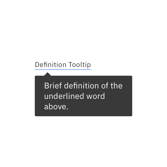
- Icon tooltip code, Carbon design system
- Definition tooltip, Carbon design system
What to do
When
onhoveroronfocustriggers new content to display, it must remain visible until dismissed by the user or the hover content becomes invalid. Doing so gives users control of dismissing hover content when it overlays information they need to see.Follow the design to implement all actions that dismiss hover content:
- Escape key pressed.
- Pointer is moved off of both the hover trigger and hover content.
- May implement Tab key when hover has no interactive content.
- May implement activating Cancel button in hover content (both by mouse click and by keyboard)
Additional instructions:
- Avoid using timers that trigger dismissing hover content.
- When hover content contains interactive elements, moving keyboard focus from the trigger to the hover content does not dismiss the hover content.
- Only use
mouseOutto dismiss hover content when the pointer is moved off of both the trigger and hover content. Consider a brief delay to avoid dismissing the content due to irregular pointer movement. The pointer may briefly move off of both elements in an effort to move to the hover content. - When hover content contains information that becomes invalid, it is OK to automatically dismiss the hover without a user action.
Techniques
Requirements and resources
- 1.4.13 Content on Hover or Focus, IBM accessibility requirements
- Icon tooltip code, Carbon design system
- Definition tooltip, Carbon design system
What to do
Moving the mouse pointer between the hover trigger and the new content, in either direction, must not dismiss the hover content, even when there is space between them. Users with disabilities may need to change magnification, move the pointer, or simply `bring the new content into their visual field’.
Requirements for dismissing the hover content are covered in the section on keeping hover content visible until dismissed.
Techniques
- F95: Failure of Success Criterion 1.4.13 due to content shown on hover not being hoverable
- SCR39: Making content on focus or hover hoverable, dismissible, and persistent
Requirements and resources
- 1.4.13 Content on Hover or Focus, IBM accessibility requirements
- Icon tooltip code, Carbon design system
- Definition tooltip, Carbon design system
What to do
All mouse operations need an equivalent keyboard operation. Ensure that elements where
onhoverormouseoveris used to trigger display of hover content have an equivalentonfocusinteraction.The HTML
titleattribute is commonly used to present a visual tooltip. However, this method of coding a tooltip is not keyboard accessible. Keyboard accessible tooltips, word definitions, and other non-modal popups that display while hovering over a target element are best provided using a customrole="tooltip"withonfocustriggered keyboard equivalents.Key implementation notes for hover:
- Focus stays on the triggering element while the new content displays.
- The trigger element for hover content needs to reference the new content using
aria-describedby - The trigger element must be in the focus order (Tab and Shift+Tab order)
- Insert the hover content in the DOM after the trigger element to maintain correct reading order.
- When the trigger element receives focus, the new content displays.
Techniques
Requirements and resources
- 1.4.13 Content on Hover or Focus, IBM accessibility requirements
- Icon tooltip code, Carbon design system
- Definition tooltip, Carbon design system
What to do
Discuss with your UX designer possible alternatives to complex or frequent use of hover content, such as tooltips, and especially tooltips that contain interactive content. New content displayed on hover can be difficult to make accessible. Consider more predictable and accessible means of adding dynamic content.
Techniques
Requirements and resources
- 1.4.13 Content on Hover or Focus, IBM accessibility requirements
- Icon tooltip code, Carbon design system
- Definition tooltip, Carbon design system
What to do
Tooltip hover content that contains links, buttons, or other interactive elements commonly introduces accessibility issues. Often, we see implementations where it is not possible or not intuitive for a keyboard-only user to move focus to the tooltip interactive content. It is an accessibility failure if keyboard focus automatically moves to the content when a trigger element receives focus. Special keyboard keys to switch focus to the hover’s interactive content may not be easily discoverable or easy for users to remember. When the design includes such an interaction, have a conversation with the UX designer about the accessibility challenges for users.
When hover content contains interactive elements:
- Avoid using
role=”tooltip”which cannot contain interactive elements; instead use ARIArole=”dialog”. - It is best to have tooltip dialogs (with links, buttons, or other interactive content) that are displayed using the Enter key and an
onClickpointer event. A possible implementation is using an element with a role ofbuttonrather than a trigger element where hover or focus displays the hover content. - Ensure the user has control over moving focus to the interactive content.
- Work with the UX designer to consider whether a modal or non-modal dialog is best. Remember, modals “trap” the Tab key interaction to remain within the dialog until the user dismisses it. This is often preferable, so dialogs don’t get left behind and cover over the background content.
- If a non-modal dialog is chosen, be sure it is inserted in the correct reading order.
- When the dialog is dismissed, focus returns to the triggering element.
Restrict hover content to just text so that it's easier for keyboard users to interact with it.
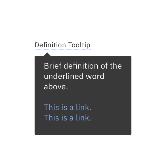
Avoid adding links or operable controls in hover content, because interactive elements increase the complexity and inaccessibility of the hover content.
Techniques
Requirements and resources
- 1.4.13 Content on Hover or Focus, IBM accessibility requirements
- Icon tooltip code, Carbon design system
- Definition tooltip, Carbon design system
- Avoid using
Ensure Esc dismisses new content
If content appears on hover, the new content needs to remain visible until dismissed
Moving the pointer away from the trigger should not be the action that dismisses the new content
Ensure custom tooltips and similar hover text can be triggered by keyboard
Discuss alternatives to hover text
Use caution where interactive controls appear in the hover text
Code cancellation actions accessibly
What to do
The best pointer behavior is to activate or execute function on the up event rather than the down event. For accessibility, this can help minimize inadvertent actions for users that have difficulty with fine motor movements. This is a consistent design for standard controls to interact in this way. When developing custom elements, be sure that the up-event is used to execute the function, or there is some other way to undo or cancel the action.
Techniques
- G210: Ensuring that drag-and-drop actions can be cancelled
- G212: Using native controls to ensure functionality is triggered on the up-event
Requirements and resources
- 2.5.2 Pointer Cancellation, IBM accessibility requirements
Provide accessible ways of cancelling pointer interaction
Properly code status messages
What to do
Users need to have feedback when actions are complete or when important application status changes occur. When presenting success or status messages in the UI, use the ARIA
role="status"on the element containing the status message. By doing so, screen readers will announce the message.Techniques
- ARIA22: Using role=status to present status messages
- G199: Providing success feedback when data is submitted successfully
Requirements and resources
- 4.1.3 Status Messages, IBM accessibility requirements
What to do
Some types of status messages are important for the user to know about in a real-time manner. Some examples of important messages are status messages that provide a suggestion or messages that warn about an error. ARIA provides the
role="alert"to cause screen reader assistive technology to interrupt other spoken information to announce the important message.Pro tip: Not all examples in the techniques below use status messages to convey warnings or errors to users. You only need to use the
"alert"where is a change of context does not take place, such as a focus change.Techniques
- ARIA19: Using ARIA role=alert or Live Regions to Identify Errors
- G83: Providing text descriptions to identify required fields that were not completed
- G84: Providing a text description when the user provides information that is not in the list of allowed values
- G85: Providing a text description when user input falls outside the required format or values
- G177: Providing suggested correction text
- G194: Providing spell checking and suggestions for text input
Requirements and resources
- 4.1.3 Status Messages, IBM accessibility requirements
Use role=status to advise on the success or results of an action
Use role=alert or an ARIA live region to convey a suggestion or warning
 Level 3
Allow reduced motion
What to do
The
prefers-reduced-motionmedia query is part of the level 5 CSS specification. It allows developers to query the user’s system preference for reduced motion, via the browser, and reduce or eliminate animations accordingly. In some cases, designers will simply ensure their design is operable if motion effects are disabled, and developers will hide animation based on the media query. However, designers may provide variations in design based on whether users prefer reduced (or no) motion, and these may lead to what is effectively a responsive design implementation. These decisions should be annotated in the wireframes, so that developers can properly implement.Techniques
Requirements and resources
- Designing with Reduced Motion for Motion Sensitivities, Smashing magazine
- Understanding 2.3.3 Motion from Interactions, WCAG 2.1 (level AAA)